Analysis on 20701 SC-TPTY Vande Bharat based on first charts generated every day from inauguration till May 12th
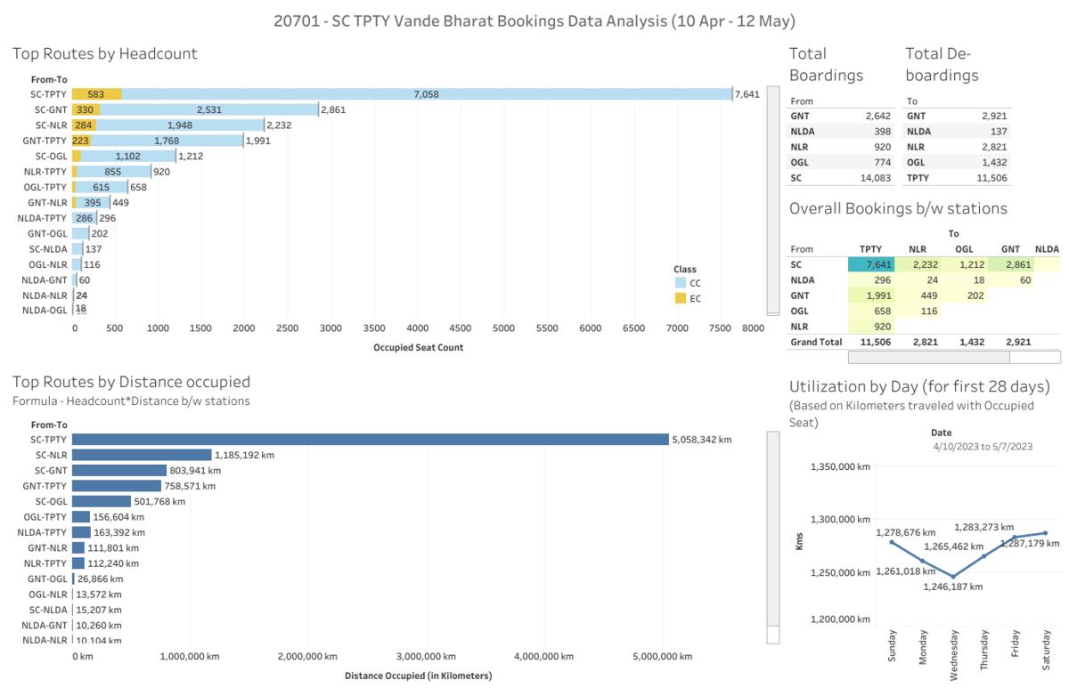
1. Dashboard - Some insights
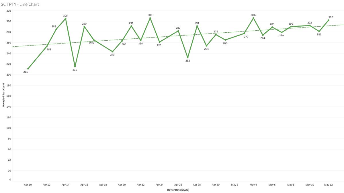
2. SC - TPTY Line chart -Shows Count of people travelled from SC to TPTY every day
3....
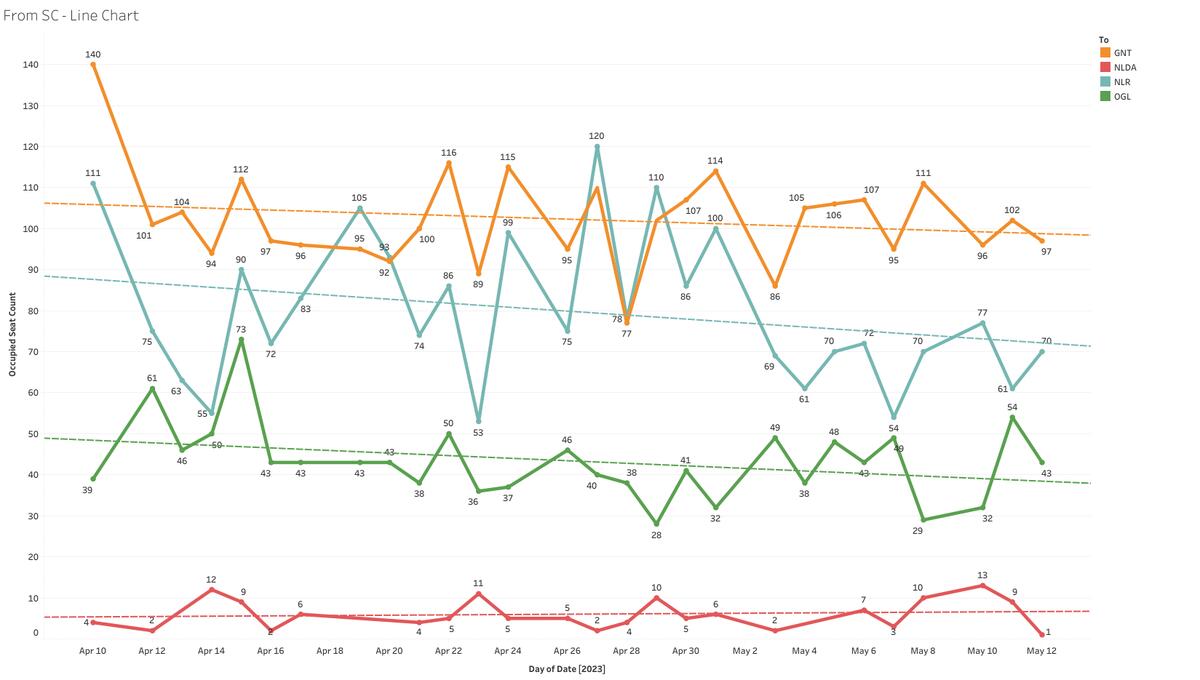
more... From SC Line chart - Shows Count of people travelled from SC to various destinations (excluded TPTY - check 2)
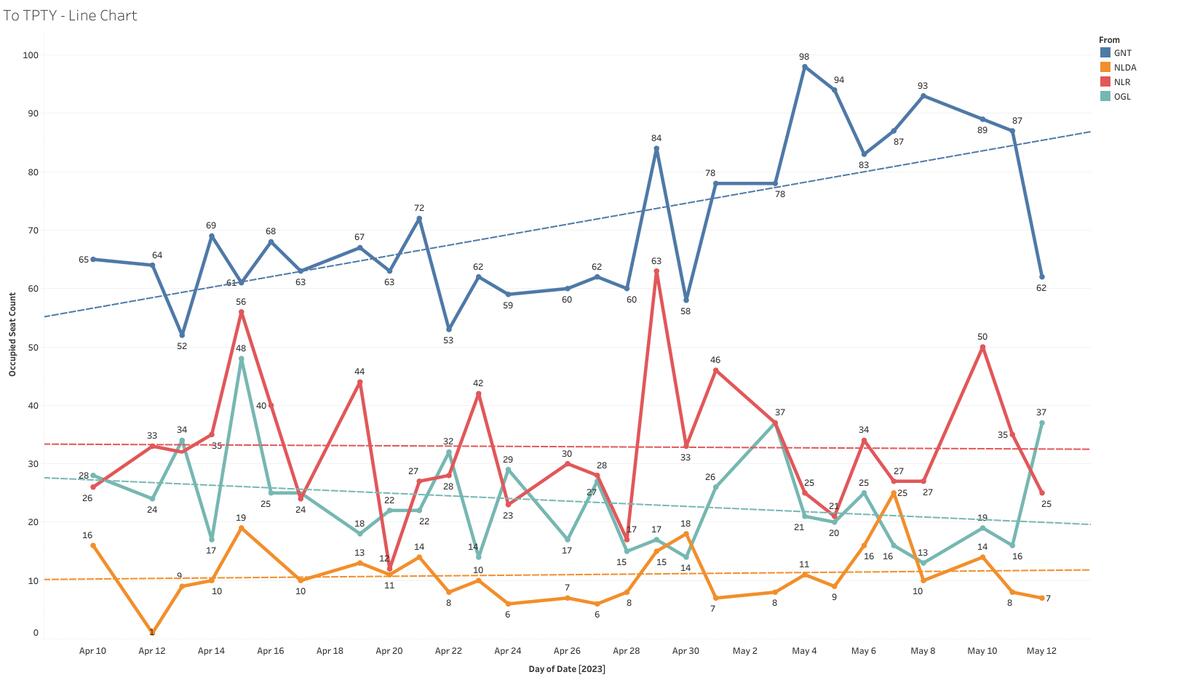
4. To TPTY Line chart - Shows Count of people travelled to TPTY from various destinations (excluded SC - check 2)
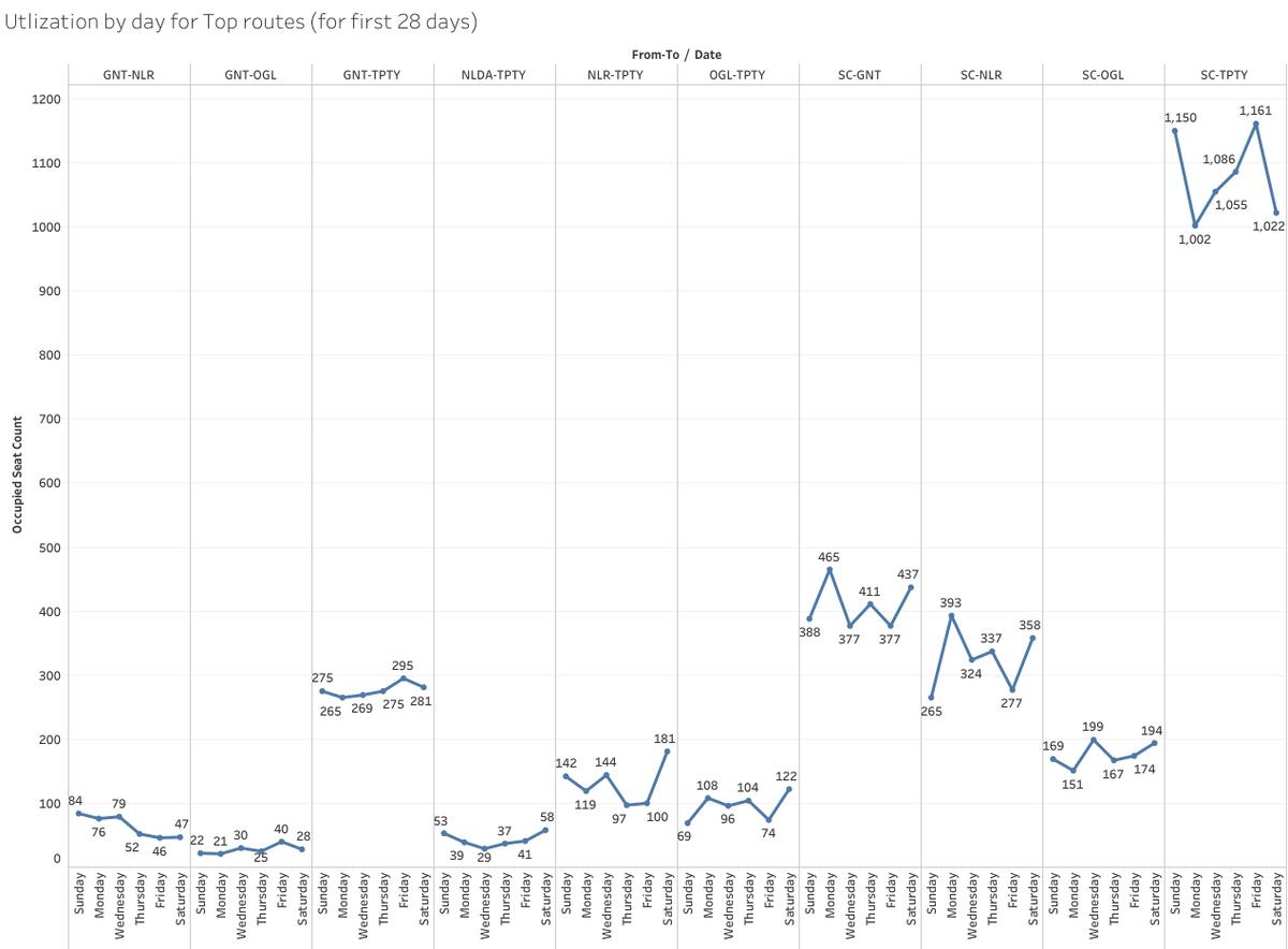
5. Utilization by day for some top routes
6. Excel Dataset (20701 Apr10 - May12)
Note - For points 2,3,4 there are dotted lines(trend line) in the line charts which basically shows upward/downward trend. It is tool suggested trend line which has around 90% accuracy. I haven't made any formula in the background or made some analysis on it and CANNOT suggest it as the best.
Dashboard link (best viewed on desktop/laptop) -
click hereI'm trying to learn something on data analysis/data analytics, Any suggestions on these charts are welcome
Data Source - IRCTC online charts API
Link for 20702 TPTY SC VandeBharat Analysis -
/blog/post/5721462
please wait...Translate to EnglishThis is an analysis of the 20701 SC-TPTY Vande Bharat train based on the first charts generated every day from the inauguration until May 12th. The dashboard gives some insights. There are line charts for people who traveled every day from SC to TPTY, people who traveled from SC to other destinations (excluding TPTY), and people who traveled to TPTY from other destinations (excluding SC). There is also a chart for utilization by day for some top routes. The Excel dataset for April 10th to May 12th is also available. Note that there are dotted lines in the line charts showing the upward/downward trend, which is a suggested trend line tool with about 90% accuracy. No formula has been made in the background, and it cannot be suggested as the best. The dashboard is best viewed on a desktop/laptop and can be accessed through this link.